Yatra.com proudly boasts they are India’s “leading online travel company”, offering a host of services that are designed to make the traveler’s life more convenient, such as hotel reservations, transportation bookings, holiday packages and the like.
What’s more, they claim to be able to offer the best rates for Indian travelers on all of the services they offer, thanks to negotiated deals with hotels, airlines and so on.
To underline their status as the country’s number one travel portal on the web, Yatra recently issued a press release announcing for the first time that they had received over 3 million hits during the month of March.
All this may very well be true. So why is it that such a ‘perfect’ website looks and performs so appallingly bad?
We feel very sorry for the 3 million plus users who have to put up with such an inadequate travel service.
Given what can be achieved with a website these days by a determined programmer, or even just an amateur developer who is able to harness the awesome potential that is offered by frameworks such as WordPress or Joomla, Yatra can have no excuses for the sloppy performance of their web portal.
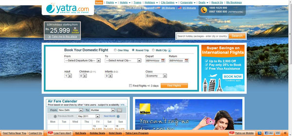
Yatra.com is simply horrible to use. From the very first moment you log onto their home page, your eyes are assaulted by the awful clash of the orange and blue color scheme which literally jumps off the page at you, trying to tear your eyes out.
After taking a few moments, blinking, struggling to compose yourself, you can start to make out the ugly jumble of booking forms and advertisements that make up the mess that is the home page, which of course, tells you precisely nothing.
Many people use the internet to research a destination before they go there. But locating any information on Yatra is a painful exercise in dogged determination. The layout, the presentation, it is woefully inadequate.
For starters, the navigation leaves a lot to be desired. There are no images enticing you with their awesome natural beauty, no headlines boldly proclaiming the fun to be had at India’s top destinations. Just a single, bland, difficult to locate menu bar at the top of the screen, which you can easily miss if you so much as scroll down even a fragment of the page.
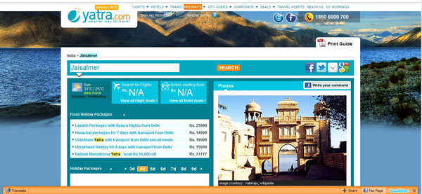
Clicking on the ‘City Guides’ tab and you are subjected to an agonizing wait as its archaic servers struggle to link you to where you want to go, before delivering you to dull, uninspiring list cities and ‘attractions’. Truly inspiring stuff.
So we select where we want to go from the bland list of ‘highlights’ and, following another interminably long wait we finally reach the destination page. And it’s enough to make you actually want to be sick.
We are instantly bombarded with more ads – holiday package deals leap from the page as if they are trying to strangle you into submission. Poor quality, unlabeled images of unknown sights make our destination seem about as appealing as spending our holidays in Afghanistan.
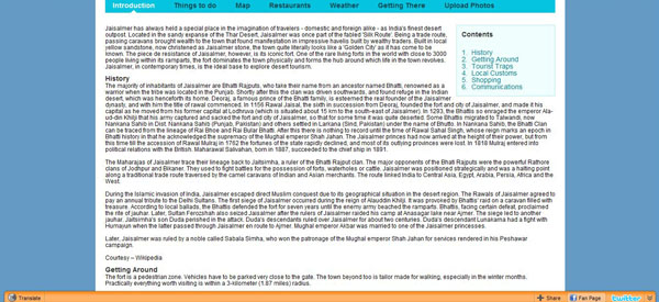
Ever the optimist, we scroll down to the page anyway to at least see if we can read about the destination.
Ah ha! And finally we have some information about the place. Only sadly, even the most hardened sadist would struggle to read it all.
Rather than trying to entice us with the destination’s charms, the information is presented as one huge, ugly block of text, written in a font size that would strain the eyesight of the Hubble Telescope, let alone a poor travel writer such as myself. But that’s only the start of it.
Start reading and you’ll quickly come to realize that the person who wrote about the destination simply doesn’t know how to write. Poor word choice, poor grammar, a limited vocabulary and a dull, uninspiring tone leaves the impression that there is probably not a soul on Earth who has bothered to try and digest the text in its entirety.
Many links simply don’t work. Try reading about some of the “Things to do” and clicking on ‘more’. There is no more, just an Error 400: Bad Request page.
With no addresses listed, no contact numbers, no official websites linked, the average traveler with have next to no inclination to go and find these places.
All this from a site that bills itself as the most “enhanced, user-friendly experience” for travelers; one that is “continually striving to improve its features and service delivery”.
We feel very sorry if this is the best that Indian travel companies can offer us.
View Comments (2)
The website is in bad shape because Indians are sloppy developers.
Hi,
I don't think that's really true, I know a lot of very good Indian developers. You get good and bad ones in every country I guess.. the problem with Yatra is they have no competitors to force them into doing something about their terrible design!